 info@queryfinder.com
 +91
8000841620
+91
8000841620
 +1 (778)
882-3143
+1 (778)
882-3143

Companies often use machine learning to gather huge amounts of mixed data that can be difficult to sort through, comprehend and explain. Data visualization the process of showing processed information in picturised form, can speed these processes up and present information to business owners and stakeholders in ways they can understand.
Data visualization components
Data visualization components provide more detailed or alternate views of the data.
1. Chart
Displays data using standard chart formats, including:
Bar charts
Line charts
Area charts
Pie charts
Scatter charts
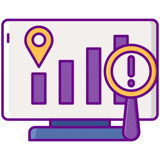
Users can search for locations, and display details for a specific location.
Bubble charts
2. Map
Displays one or more map layers. Each layer represents a set of geographic locations.
The Map component configuration includes:
The lists of locations, including:
-
The geocode attribute representing the location
-
Display options for the map layer points
-
Sorting and pagination options
-
The attributes to include in the location details
-
The available search options
3. Pivot Table
Generates a table that allows users to perform comparisons and identify trends across several cross sections of data.
Users can export the data to a spreadsheet, and may be permitted to change the table layout.
The Pivot Table component configuration includes:
-
The metrics and dimensions to display
-
Highlighting for specific metric values
-
Available actions
-
Other display options such as the table height and the column width.
4. Summarization Bar
Display a set of summary items that contain summary values from the data. A summary value can be a metric (such as average sales), a dimension value associated with the lowest or highest value of a metric (such as the region with the highest sales), or a number of flags. Flags indicate dimension values for which associated metric values have passed a specified threshold.
The Summarization Bar configuration includes:
-
The metric and dimension values to display
-
Conditional formatting to highlight the summary item for specific ranges of metric values
-
The text size for the summary item title and value
5. Tag Cloud
Displays a distribution of terms based on the value of an associated metric. The font size reflects the metric value. The higher the metric value, the larger the font.
The component can display in cloud view, with the terms in alphabetical order, or in list view, with the terms ordered by the metric value.Users can refine by the displayed terms.
The Tag Cloud component configuration includes:
-
The available dimensions (Tag Cloud terms) and metrics (values used to organize the terms)
-
Whether to display the metric value next to each Tag Cloud term
-
The number of terms to display
-
The default display format (cloud of list)
-
The range of text sizes for the displayed terms
Benefits Of Data Visualization
1. Visualized Data Is Processed Faster
2. Data Visualization Dashboards Support Visual Learners
3. Data visualization tools show insights that may be missed in traditional reports.
4. Data visualization gives actionable items.
5. Data visualization increases productivity and sales.
Using data visualization to recognize trends is a key feature of using data insights to improve performance. Being able to visualize trends by sales rep, by quarter, by year, or by SKU allows for greater awareness into the pulse of the company and allows actions to be taken to continue favourable trends and to reverse negative trends.
Data visualization allows organizations to capitalize upon our natural ability to recognize and process visual images faster than written language. Because of the brain’s ability to recognize and remember images, online data visualization tools help teams see insights that may have been missed, create actionable items, and ultimately, increase sales.
QueryFinders Solutions team use many data visualizations tools with to get maximum visualization of business information in summarized manner, so that business experts can take future decisions based on that. If you are looking for business ERP system with sales, orders and payments summary with appropriate visualization with accurate data, then you are making right decision of choosing query finders solutions.